There are endless and colorful colors, but there are certain internal connections between various colors, and the same is true for paint colors. In addition to protection and corrosion prevention and some special functions such as mildew prevention, conductivity, and noise reduction, the most important function of paint is to decorate the home with a colorful atmosphere of life. However, since each color has its own characteristics, it has strong and different effects on people's vision, psychology, physiology, etc. Let us learn about the basic knowledge of paint colors and how to adjust colors.
Mastering the basic concepts of color is the basis of paint color adjustment.
Each color can be determined by 3 parameters, namely hue, brightness and saturation. Hue is the characteristic that distinguishes colors from each other. It is determined by the chromatographic composition of the light source and the feeling of the various wavelengths emitted by the surface of the object on the human eye. It can distinguish red, yellow, green, blue, purple and other characteristics. Brightness, also known as brightness, is a characteristic value that indicates the change in the degree of lightness and darkness of the surface of an object. By comparing the brightness of various colors, colors can be divided into bright and dark. Saturation, also known as chroma, is a characteristic value that indicates the intensity of the color on the surface of an object, which makes the color bright and dark. Hue, brightness and saturation form a three-dimensional space. By using these three elements to establish a scale, we can measure colors with numbers.
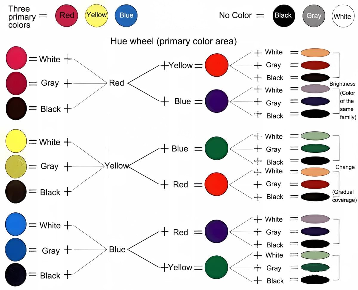
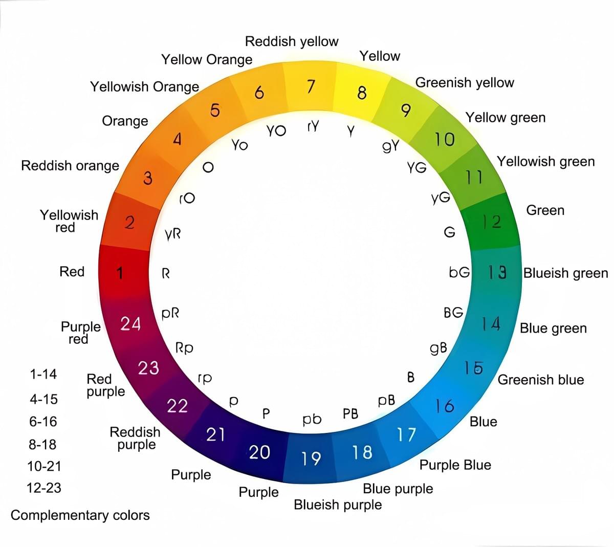
The colors in nature are ever-changing, but the most basic ones are red, yellow, and blue, which are usually called the three primary colors. Another color mixed with these three primary colors in different proportions is called a complex color. For example, red + yellow = orange; blue + yellow = green; orange and green are called complex colors. The complex color formed by the three primary colors has another color corresponding to it in the color circle as its complementary color. For example, yellow and blue make green, and the corresponding red is the complementary color of green.
In color matching, adding white to dilute the primary or secondary color will produce colors with different "saturations", and adding different amounts of black will produce various colors with different "brightness". Adding complementary colors to secondary colors will darken the color, or even turn it into gray or black.
Color creates a different environment, good or bad.
Reasonable color arrangement is of great significance in creating a comfortable work, working and living environment. Color adjustment can make the environment brighter; reduce eye and body fatigue; enhance the fun of work and improve labor efficiency; create a specific environment, embody a certain style and mood; reduce accidents and disasters, improve work quality; enhance the psychological care for materials, etc.
Color adjustment and paint color matching ten major skills
Although there are quite a lot of varieties of various single-color paints (also known as primary color paints), they are far from meeting people's needs. This requires painters to use the existing primary color paints to mix more colorful colors in actual work. Color matching is a relatively complex and meticulous work, because there are many types of colors, it is necessary to understand the properties of various pigments, and it is also necessary to accurately judge the color differences. Artificial preparation of complex color paint mainly relies on practical experience, according to the required color paint sample to identify the existence of several single-color compositions, the approximate proportion of each single color, do small sample mixing experiments, and then prepare, but it must also be carried out according to the basic principles of color science. There are some tips for color matching:
(1) Be careful when matching colors. Generally, try a small sample first to preliminarily determine the amount of paint to be matched, and then prepare a large sample based on the results of the small sample. First, mix the secondary color and the secondary color separately in a small container.
(2) First add the primary color (the color with large usage and low tinting power in color matching), then slowly and intermittently add the dark color (or matching color) with strong tinting power, and keep stirring, and observe the color changes at any time.
(3) "From light to dark", especially when adding pigments with strong tinting power, avoid excessive addition.
(4) When matching colors, there will be slight differences between the color of the paint and the color of the dried film. The colors of various paints are generally lighter when wet, and the color deepens when the paint dries. Therefore, if the sample is a dry sample, the matching paint needs to be dried before color measurement and comparison; if the sample is a wet sample, you can drop a drop of the sample in the matching paint to observe whether the two colors are the same.
(5) You should understand the floating degree of the primary color in the secondary paint and the changes in the paint in advance.
(6) When mixing complex color paints, paints with the same properties should be selected for mixing, and the solvents should also be miscible. Otherwise, due to the poor compatibility of the paints, the quality will be affected, and even stratification, precipitation or gelation will occur, making them unusable.
(7) Since colors often have different color heads, for example, when mixing pure green, yellow with a green head and blue with a yellow head are generally used; when mixing purple, blue with a red head and red with a blue head should be used; when mixing orange, red with a yellow head and yellow with a red head should be used.
(8) Pay attention to what auxiliary materials should be added during the color mixing process, such as drying agents, curing agents, diluents, etc., so as not to affect the color.
(9) When mixing gray, green and other complex color paints, due to the preparation of multiple pigments, the density of the pigments, and the different oil absorption, it is very likely that "floating color" and "floating" phenomena will occur. At this time, a small amount of surfactant or leveling agent or anti-floating agent can be added as appropriate to solve the problem. As usual, add 0.1% silicone oil for prevention and treatment. The various surfactants produced by foreign companies need to be distinguished in which solvent system they are used. The amount added is generally 0.1-1%.
(10) Taking advantage of the slightly transparent characteristics of the paint film, the selection of a suitable base color can make the color of the topcoat more vivid than the original paint. This is based on the principle of natural reflection and absorption. It is a color produced by the superposition of the base color and the original color. It is called "transparent color" in paint engineering. For example, yellow primer can make red brighter, gray primer can make red redder, pure blue primer can make black darker and brighter, and water blue primer can make white cleaner and whiter. Cream, pink, ivory, sky blue, white should be used as the primer.
Once you are familiar with the basic color matching, the paint color matching process will be handy, and it will be easier to master the ten major techniques for paint color matching.


